
Choosing outfits for family photos is one of the biggest stress points for most families—and I get it. You want your pictures to look timeless, flattering, and cohesive, but color choices can make or break the final result.
And let’s be honest: not every color translates well on camera. Some shades take over the whole image, while others clash with your skin tone or the location. This is especially true with warm color clothes like red, orange, and yellow. They’re bold, eye-catching, and full of personality—but also tricky to pull off in photos.
That doesn’t mean you can’t wear them. It just means you need to know how to wear them. Today, we’re diving into warm undertone colors to wear for family photography—so you get vibrant, beautiful images without the “oh no, why did I pick that shirt” regrets.
Why Warm Colors Are Tricky in Photos
Warm colors—reds, oranges, and yellows—are naturally dominant. They draw the eye first, which is why stop signs, traffic cones, and caution tape are designed in these hues. In photos, that means if you go too bold or neon, your outfit steals the spotlight… and suddenly your family photos are all about the shirt instead of the people.
The solution? Choosing warm undertone colors to wear that are softer, muted, or layered into patterns. These subtle versions let the warmth of the color enhance your images without overwhelming them.
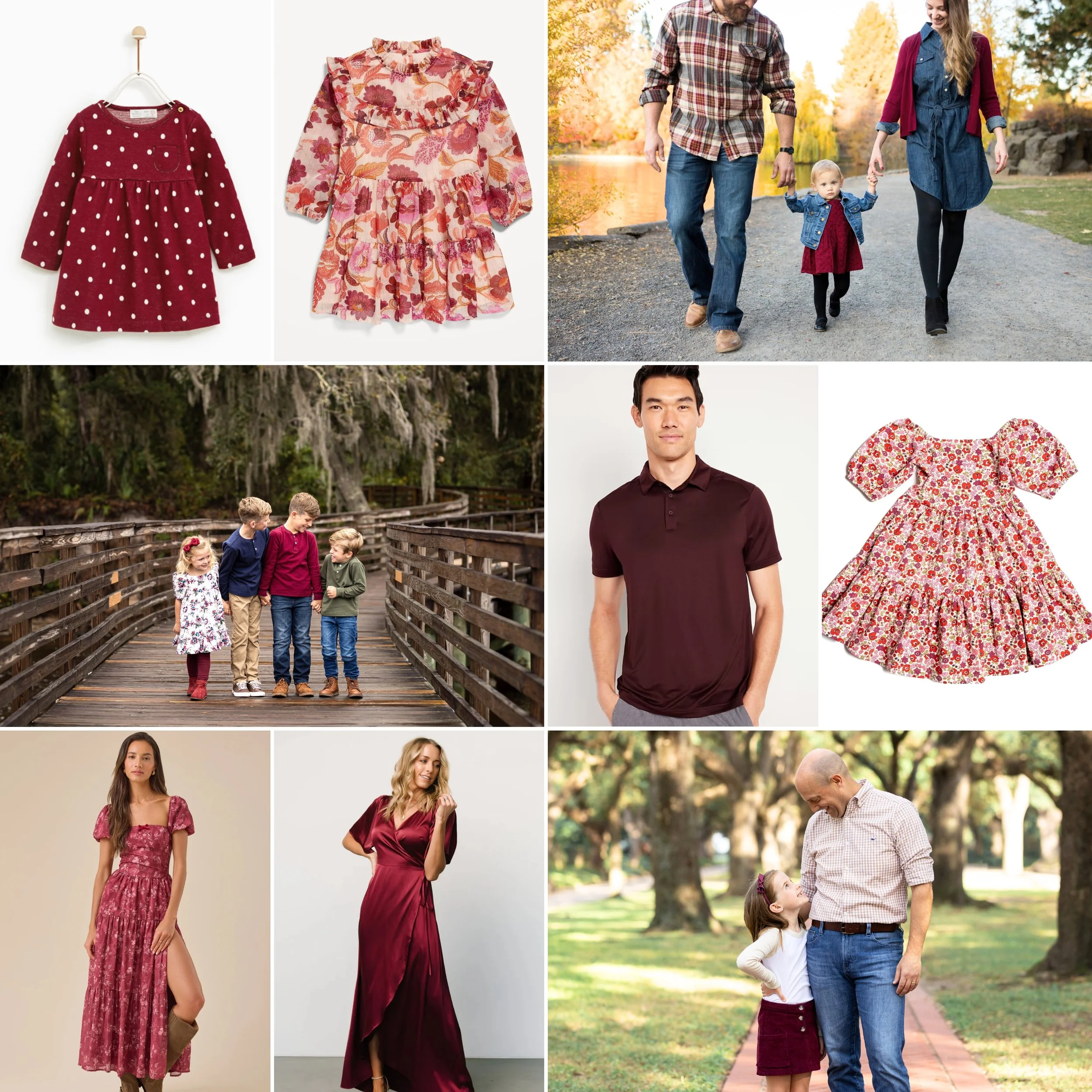
Wearing Red in Family Photos
Is red my favorite color for sessions? Honestly, no. But I know some of you love it, so here’s how to make it work.
-
Stick with darker, richer shades: cranberry, ruby, maroon, or burgundy photograph beautifully.
-
Use red as an accent color or part of a pattern (think plaid shirts, floral dresses, or a scarf).
-
Pair red with neutrals like cream, tan, navy, or off-white to balance its intensity.
Pro tip: Skip fire-engine red. It tends to dominate group photos and can reflect unwanted color onto skin. It also screams CHRISTMAS so unless you want to display your photos only around the holidays, skip this option
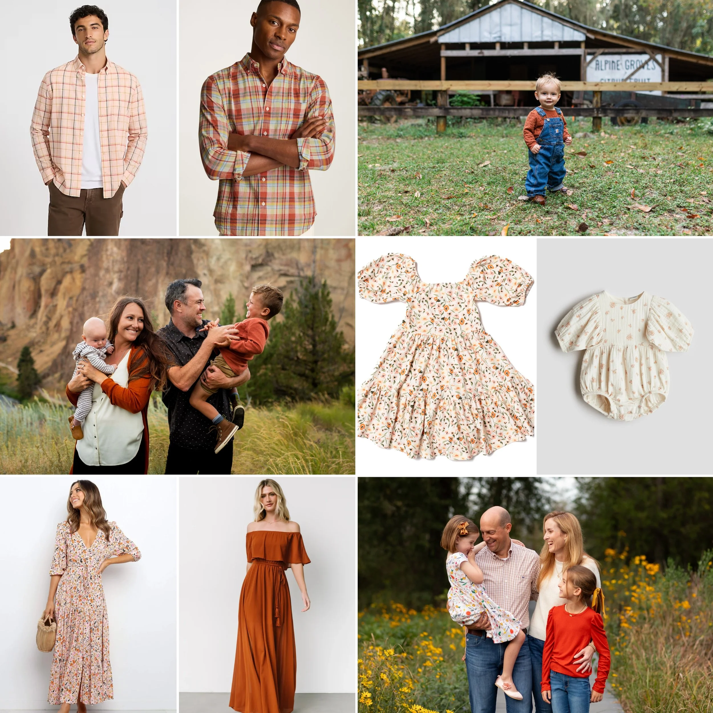
Wearing Orange in Family Photos
Bright orange? Hard pass. But muted versions of orange can look warm, rich, and cozy in photos.
-
Choose dark, earthy tones like cider, squash, yam, or ginger.
-
For a lighter option, go with peach or apricot—soft, delicate, and flattering.
-
Use orange in patterns or as accents, not the main event.
-
Pair dark oranges with burnt yellows, cream, or browns. Pair peaches with blush pink, taupe, or light yellows.
Pro tip: Orange is one of the most challenging colors to coordinate in group settings. If one person wears it, keep the rest of the palette muted and neutral.
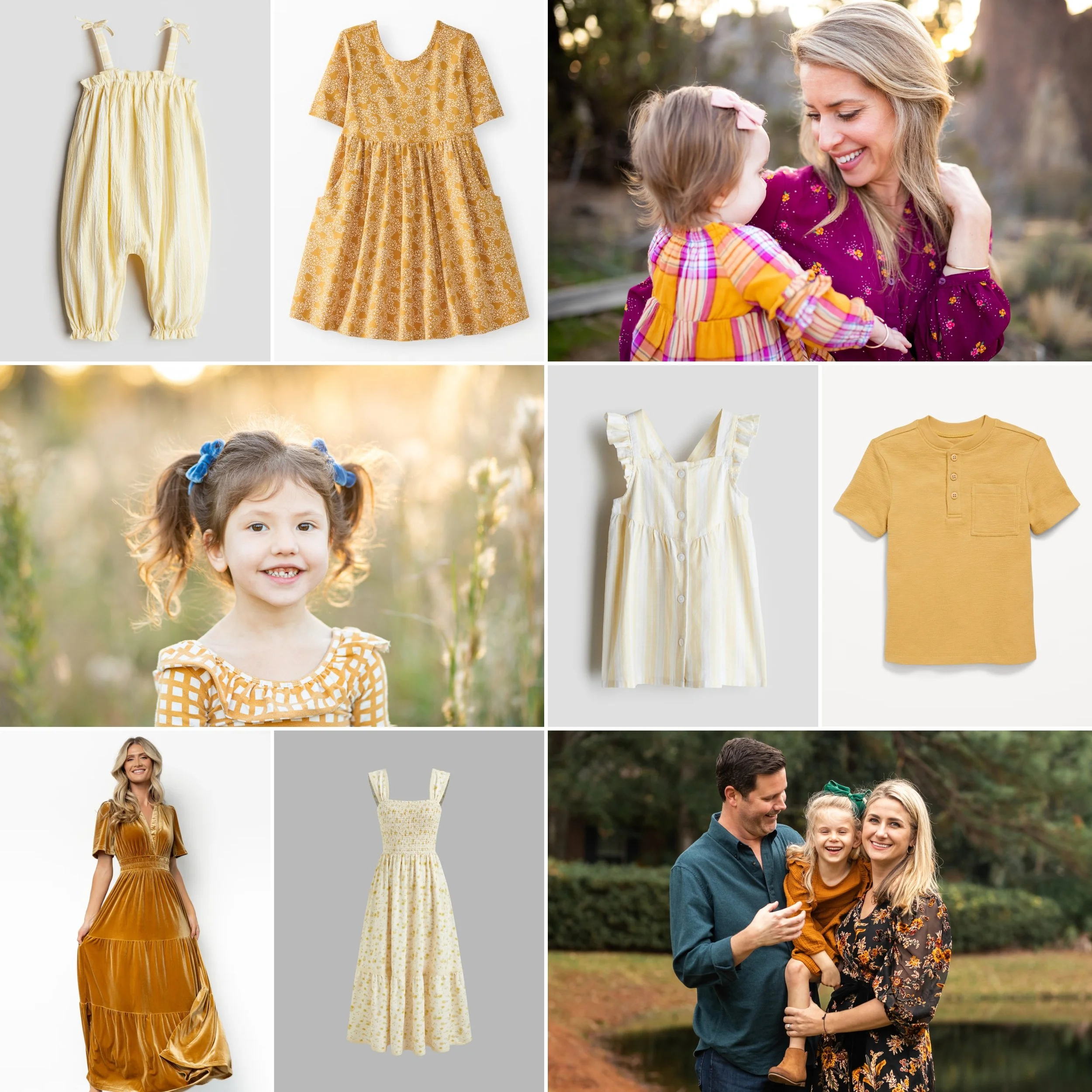
Wearing Yellow in Family Photos
Yellow is cheerful and sunny, but it can turn sour quickly in photos if the shade isn’t right.
-
Deep tones like goldenrod or mustard work beautifully in natural settings like parks or wooded areas.
-
Soft tones like buttercream or cornsilk are dreamy at the beach.
-
Avoid neon yellows (banana, lemon, highlighter)—they’ll pull focus in every shot.
-
Yellow shines when used in patterns (florals, plaids, or checks).
-
A subtle touch—like dressing your littlest family member in yellow—is often the perfect amount.
Pro tip: Yellow looks best when balanced with cream, tan, or soft pastels. It brings warmth without overwhelming.
Quick Reference: Warm Undertone Colors to Wear
If you want a fast cheat sheet for warm color clothes in family photos:
-
✔️ Do: Choose muted, earthy, or rich shades (cranberry, mustard, ginger).
-
✔️ Do: Use warm tones in small doses—patterns, accents, or on one family member.
-
✔️ Do: Pair warm colors with neutrals to balance their intensity.
-
❌ Don’t: Go neon or super bright—those tones overpower the whole image.
-
❌ Don’t: Put everyone in the same bold color. One accent is more powerful than five.
Final Thoughts
Warm colors have so much personality, and when chosen thoughtfully, they can add depth, richness, and a sense of coziness to your family photos. The key is picking warm undertone colors to wear that feel natural and timeless, rather than distracting or overpowering.
And here’s the best part—you don’t have to figure this out alone. I offer full styling support with every family photo session, complete with shoppable boards and outfit suggestions tailored to your family, your home, and your chosen location.
Because at the end of the day, your photos should reflect you—not just your wardrobe choices.
Want photos that feel timeless, connected, and stress-free? Let’s plan your session together.


+ Comments